How to paint

return to previous painting tips...

This little waterfall is not far from home but a scramble up a very wooded and overgrown gully over slippery dark rocks and knee deep water. But it is worth it. But the scene is very dark with a palette of just green, black and brown.
My aim is to make it more exciting with light and colour but retain the essence of this little piece of wilderness.
I like to use oil paint for its vibrancy and bold colours.It also suits me as I often get interrupted while painting and these paints enable me to come back to work after a few hours or even a few days and still shift the paint around.
I especially like the transparent colours as the light of the canvas can show through from behind.
While technically you can paint over any mistakes with oils, I like to protect the light coming through from the canvas. That is what keeps the painting vibrant.
So limit your use of the opaque colours.These can make a work flat. Start with plenty of lively colours. It is easy to dull a work down if it is too loud, but its very hard to rev up a dull or dark work. So I begin by blocking in thin layers of the brightest colours I can see (or imagine).
Now I start to work from the back forward. Usually the background is not the most important part. So get it done first then its easier to paint foreground over the top of it, rather than putting in your main subject and trying to fill in background around it. So work from the back forward.

Here I have done the bush up behind the waterfall. It already starts to give the painting a sense of depth. The sooner this happens, the more exciting it gets and the more fun it is to work.
I already feel I am looking up the waterfall to the distant bush. Not too much detail here, just the suggestion of detail. Try a palette knife or the side of a bit of sponge dabbed in paint. Get messy. Enjoy.

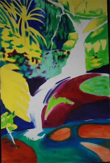
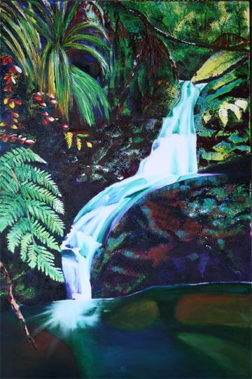
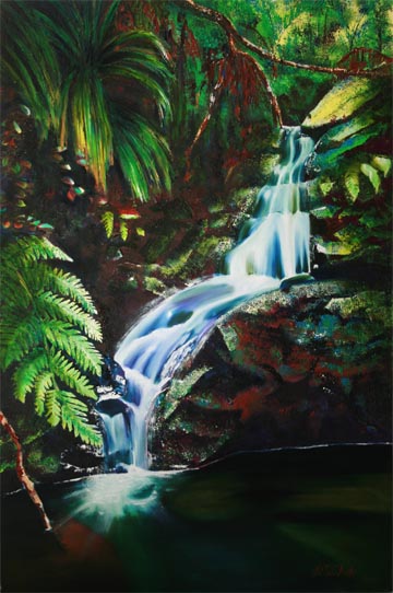
Now building in more of the fern and rock details. The foreground fern will end up green, but I want its yellow brilliance to shine through in places.

I also started mapping out the fall of the water. Each line of hidden rock under the cascade must make sense.

Again dont be afraid of throwing in a heap of colour. 
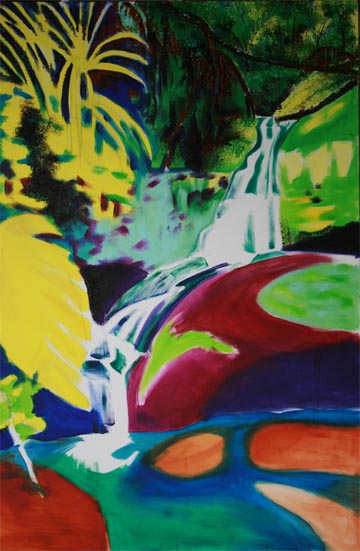
Water flowing over wet black rocks will actually be quite dark. But we dont want it to be dull. Sometimes I get away with pouring the white water on while the dark regions are still wet, then it is easier to blend the lights into the darks to give a smooth flowing water effect.

But dont worry if the water doesnt look right first go. Let it dry then come back and rub some more darks into the shadowed areas and more white into the highlights. It might take a few goes of letting it dry and adding 
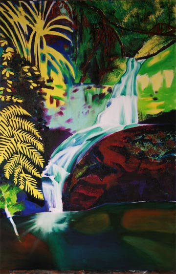
another layer. Of course I am talking transparent colours here, eg veridian green, dioxazine purple, pthalo or prussion blue, burnt sienna, burnt umber etc. Then the under painting will continue to show through.

Likewise with the rocks and pool. Just keep adding layers of transparent colour until you get the tone and depth you want.

Now I am adding more and more suggestion of detail and continuing to tone down the colours where they appear too garish. I tried putting red into the leaves on the left but greened it out later as it was too much colour even for me.

I got the blocky edges on the rock by using a small bit of square sponge.

Yes it has come a long way from the photo and a long way from the bright start of step one. But it was all good fun.

Return to start of painting tips.

Home| Paintings | Sculpture| The Artist | How to Paint | Contact Us

Copyright ©Trisha Fisk - Braveart. All rights reserved.